Case study—Wildcard
Designing an App Store #1 News experience for iPhone.
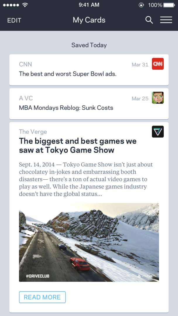
Wildcard was a unique, curated, news experience designed specifically for mobile devices. One week after it’s release, Wildcard shot up to #1 in the news category on the App Store. I worked on the core UX for the app and was responsible for developing interaction design patterns, prototypes and user testing our hypothesis.
Responsiblities
- UX/UI design for iPhone, which was later translated into an Android app.
- Interactive prototyping, interaction and animation design for native mobile.
- Developing supportive marketing design materials.
- Conducting design reviews and presentations to the entire Wildcard family.
- Running user testing sessions.
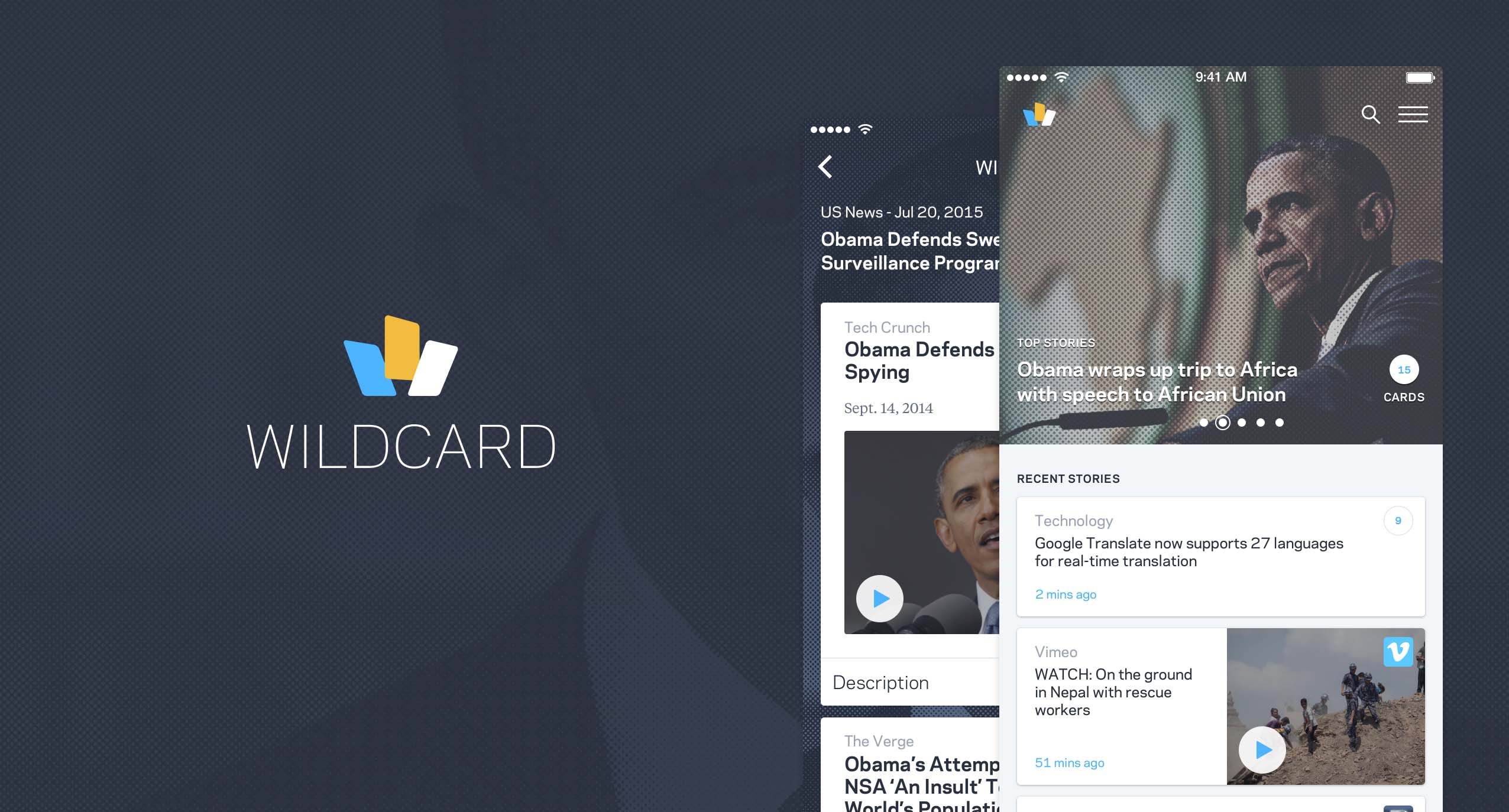
Design matters
Releasing Wildcard was not without many hurdles. The hardest of which—though the one I’m proudest of—was building a culture that valued building great user experiences. Each feature and initiative we took on at Wildcard began and ended with deep design and product thinking. That said, while our engineering prowess was certainly core, and paramount to the experiences we built, each consumer facing feature starts and stops with design discussions which involved team members from all disciplines.
These product discussions helped to push both our design and engineering teams to new heights—especially when the team was split on a feature. For instance, if we lacked the ability to shout “this is awesome, this feels great” then we continued to iterate before releasing a feature.
“I’m incredibly humbled to discover today that two apps that I played central roles on—Wildcard and Adobe Comp CC—are included in Apple’s Best of 2015 roundup.”
Khoi Vinh, VP of UX, Wildcard
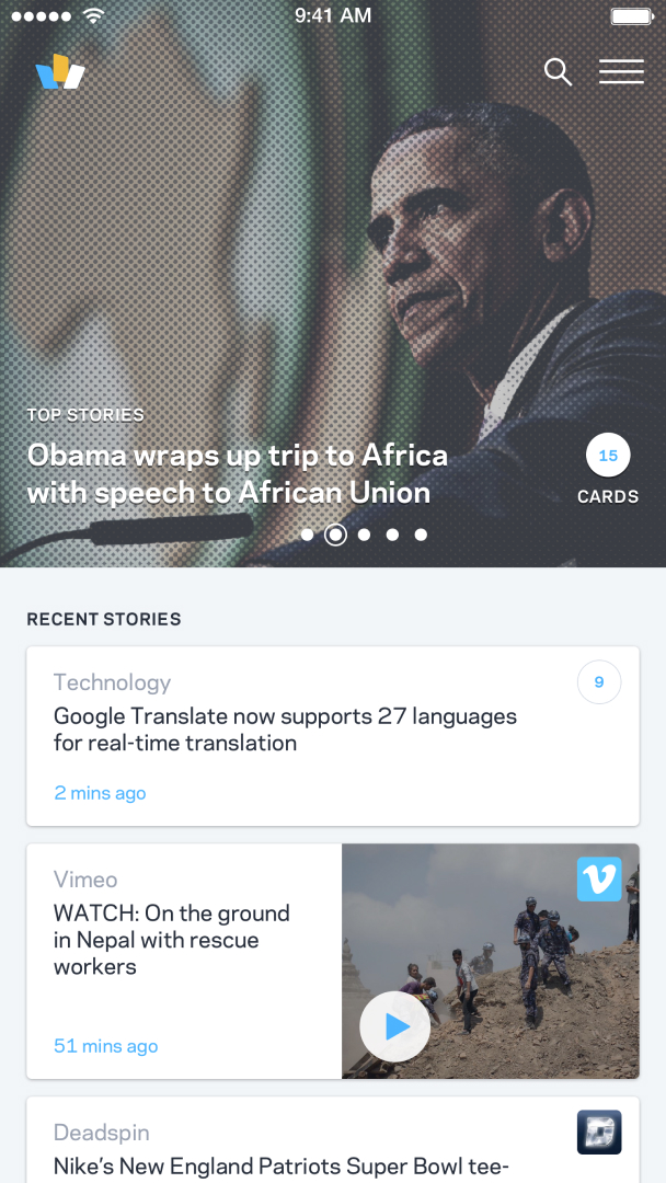
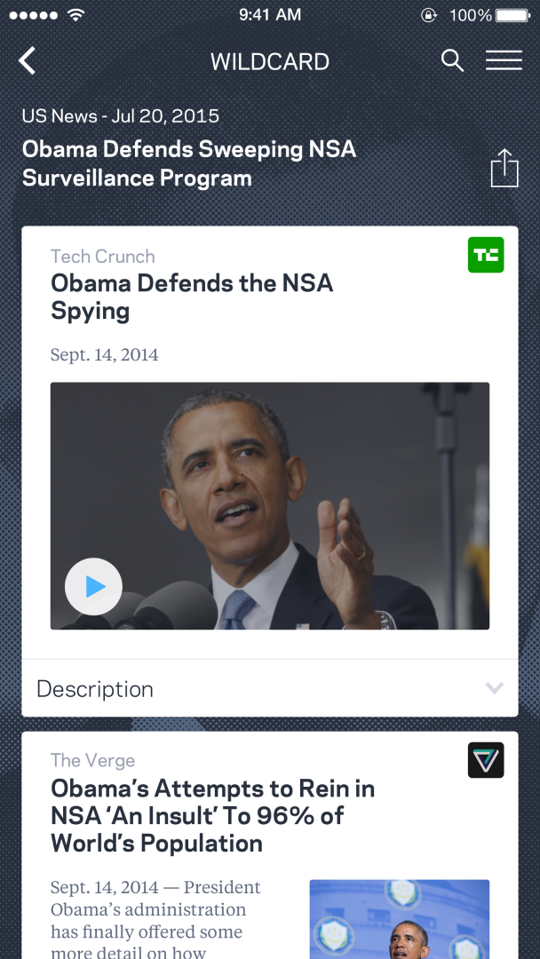
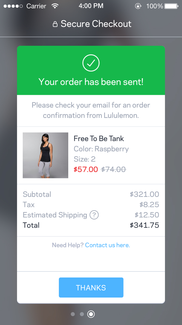
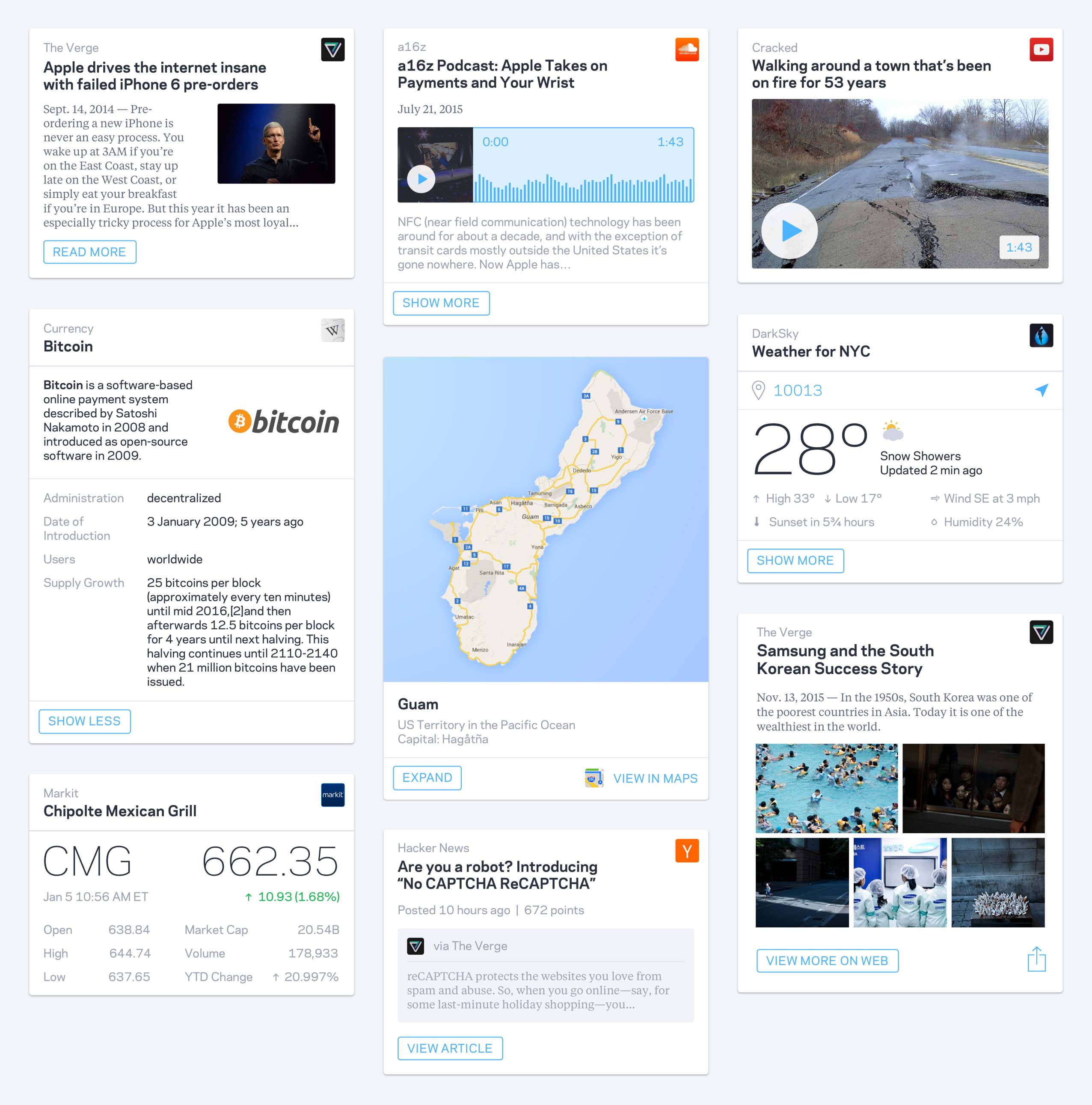
Card types
Wildcard was a unique news experience in that our editors curated content from multiple news organizations and media types to better tell the full picture, behind a story. In an ever polarizing world, Wildcard aimed to give readers multiple perspectives on a story.
As a designer at Wildcard, I would work with the team to design cards for different content types. For example: articles, slideshows, videos, weather, stocks, person, etc. Each card had a schema which would inform the content of the card. I worked on UI as well as interaction design for each card.
Designing for feeling
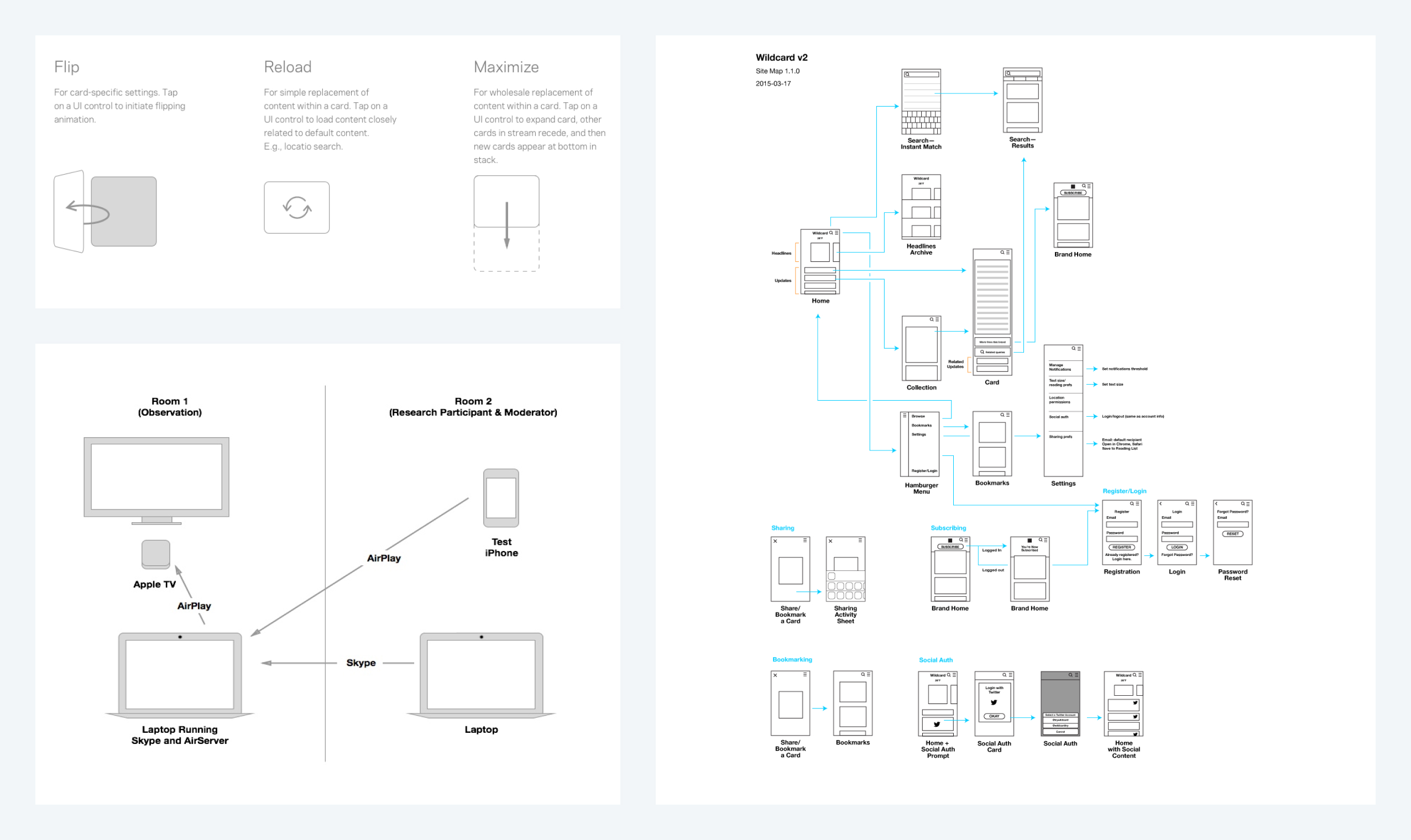
At Wildcard I was fortunate to have immersed myself in design prototyping tools. Prototyping interactions allowed us to design a unique experience for our users, one that allowed them to navigate with fluidity.
I spent many hours learning new tools like Pixate (RIP) and Origami. These tools enabled us to conceptualize navigation paradigms and workflows on native mobile devices. We could get a “feeling” for an interaction in hours, enabling us to discuss the merits of a direction—plus technical constraints—with founders and engineering partners alike.
Being able to prototype UI quickly allowed my engineering colleagues to stay focused on other tasks, which ultimately helped Wildcard to design a unique, award winning, news browsing experience.
UX design and testing
As a Product Designer, and ultimately Design Lead, I spent many hours early in the development of Wildcard exploring a wide range of problems. To articulate navigation models to the rest of my team we would construct user flows and wireframes, examples below.
These UX documents were only referenced internally. However we user tested core navigation patterns to be certain that our target audience had zero false expectations over the app experience. I ran a number of user testing sessions where my colleagues would observe the session. Overall, I found that user testing helps to level any internal debates, and it allowed us to quickly move forwards with confidence.
Closing thoughts
On interaction design
At Wildcard I had a lot of autonomy to explore the world of interaction design. I dug deep into tools like Pixate and Facebook Origami, both very popular UI prototyping tools at the time. We pushed our engineering team to develop tricky interactions, and were recognized by Apple as a Best of 2015 app.
I’m truly honored to have been a part of building Wildcard and was fortunate to work with a mentor of mine, Khoi Vinh. We designed a unique experience that was loved by many. While Wildcard ultimately closed its doors I learned a great deal about the value of prototyping and how motion can be used to help users find delight in a product, while also helping them navigate in new and interesting ways.
On design advocacy
Like most software teams Wildcard was predominantly made up of engineers. The ratio of designers to engineers was roughly 1:8. Working in an engineering heavy environment quickly taught me that as a designer we must advocate for our decisions while also being receptive to criticism.
We held biweekly design presentations for the entire organization. Everyone was encouraged to provide their thoughts. Sometimes these discussions could become tense, however everyone always had our products interest in mind. At Wildcard, I learned rather quickly to disconnect myself from any feedback. As a design leader you need to encourage feedback while also being the final say. Being diplomatic, and open, helps others feel heard. In my experience this ultimately leads to a more thoughtful product.
Thank you
Thanks for viewing my work! Everything presented here was created for Wildcard.
Contact me directly at [email protected], I’d love to chat!