Case study—Reuters Next
Visually refreshing Reuters consumer iOS apps (iPhone & iPad) for a global audience.
As a member of the Reuters Digital Design team, I worked with an incredibly talented group of folks on building Reuters Next. I was brought in during the later phases of the project and tasked with helping the team gear up for the public unveiling. The project was ultimately cancelled in October 2013.
Responsiblities
- Visual and UI design for iPhone/iPad.
- Spearheaded leading the design system for a visual/UI component library.
- Contributed to design of iconography to be used across iPhone and iPad applications.
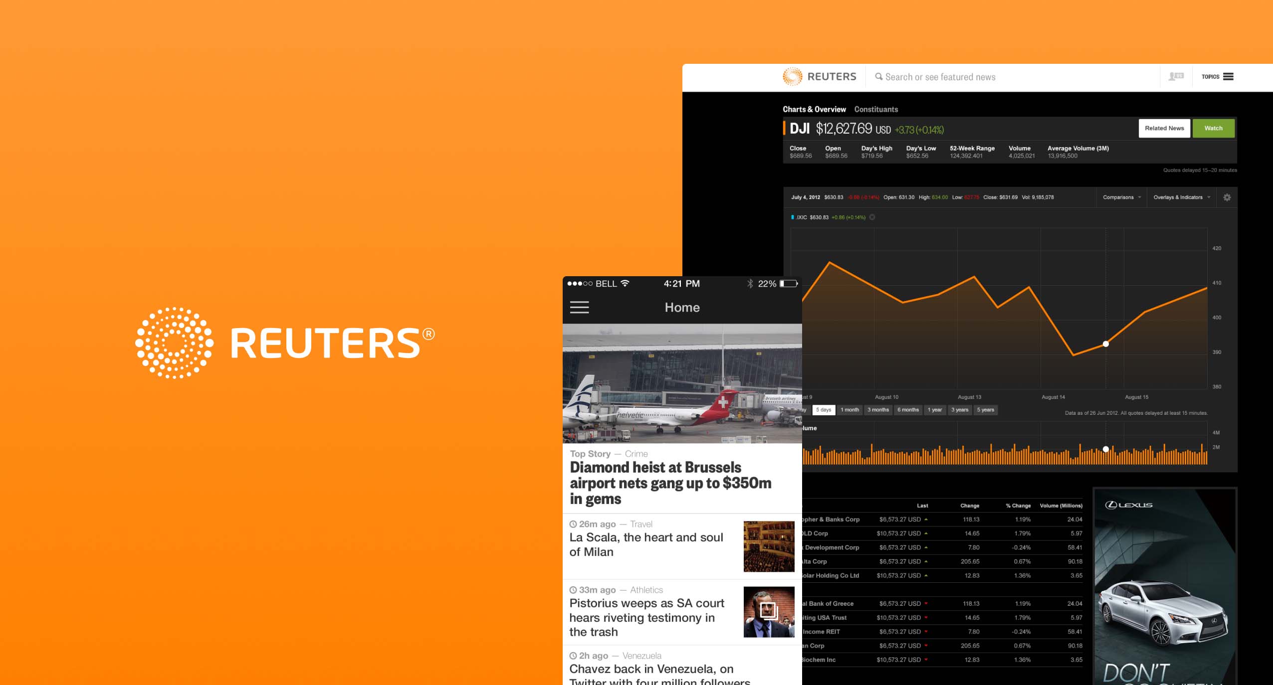
Market data
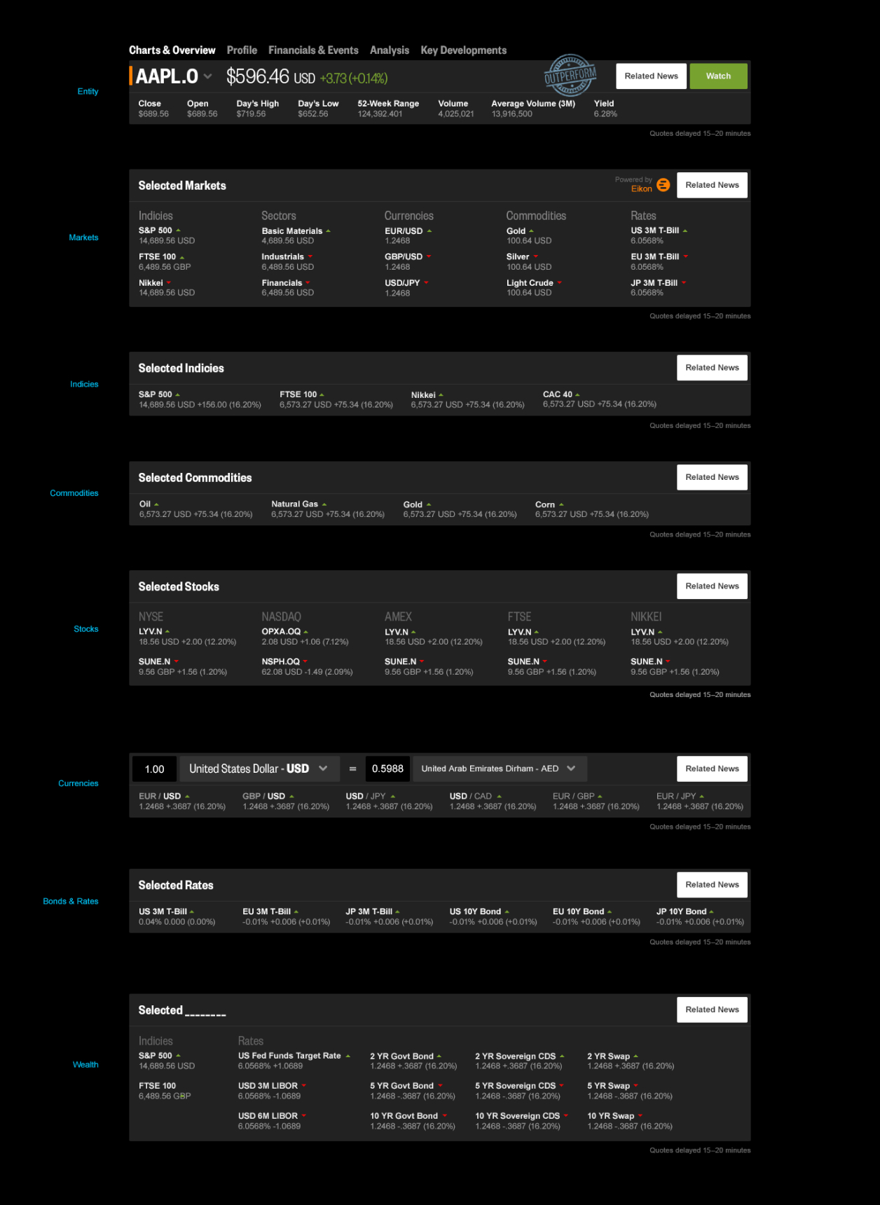
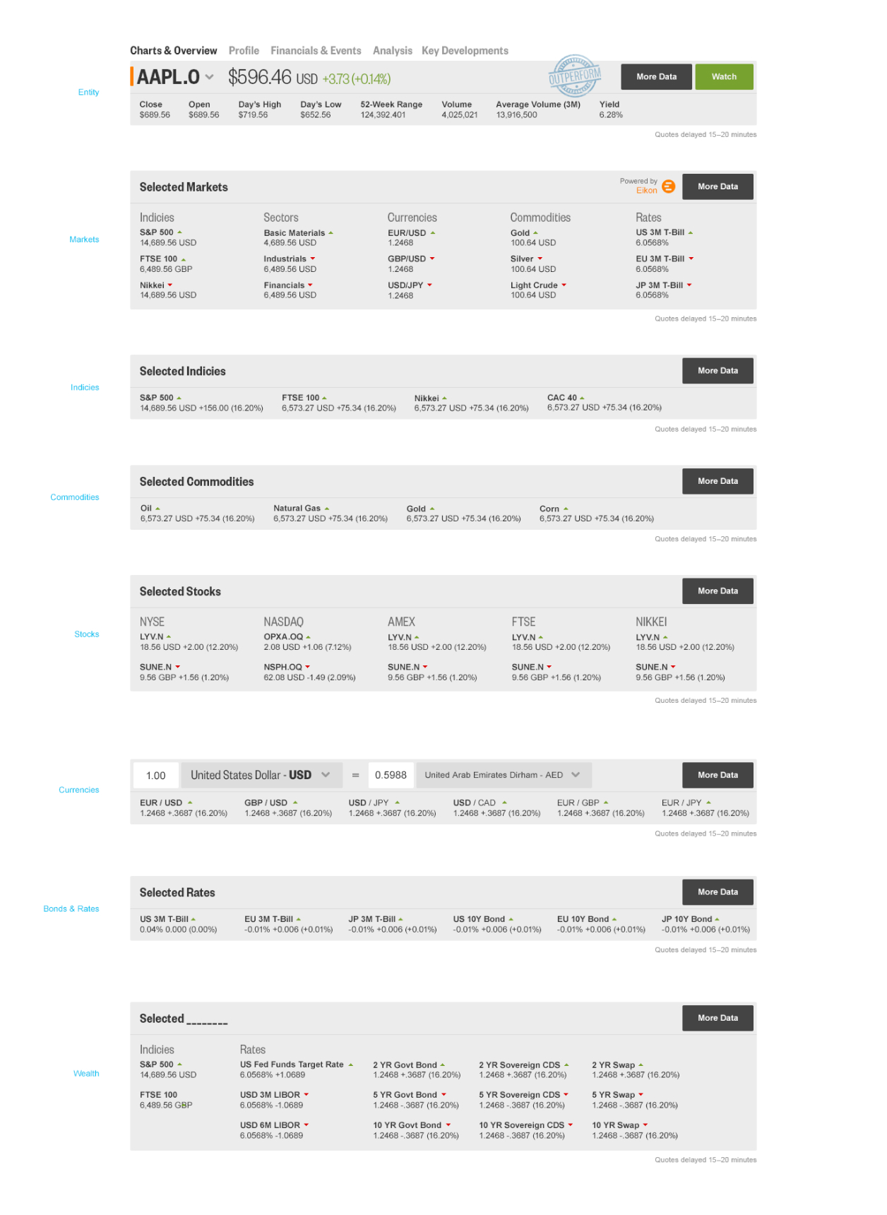
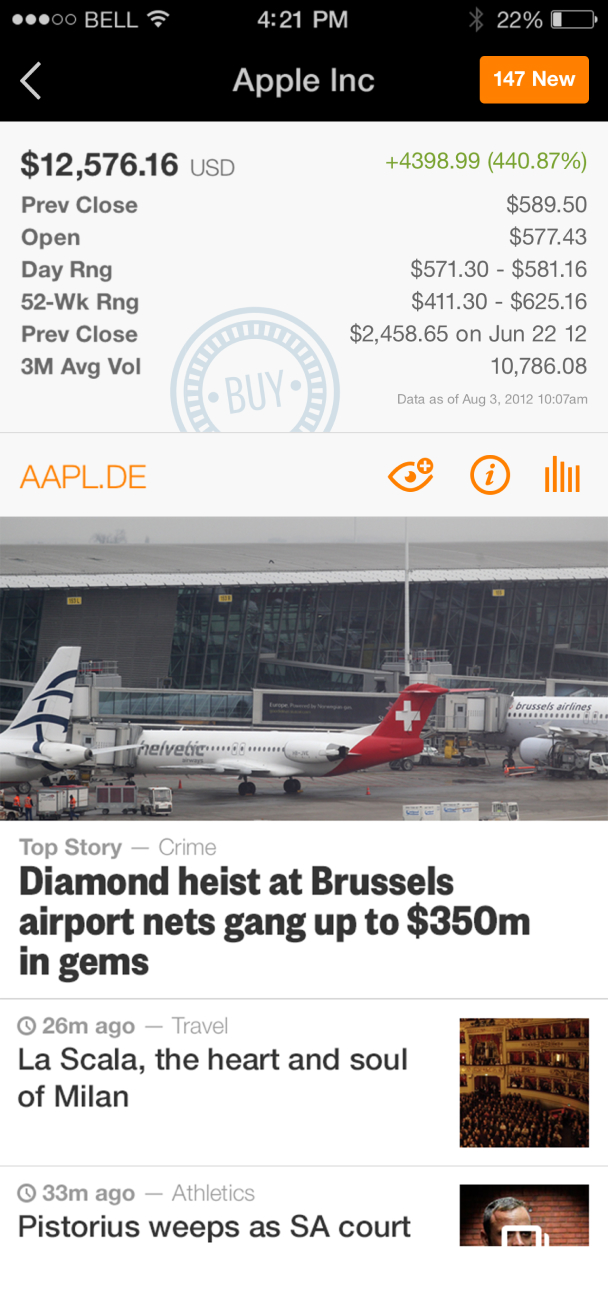
One of the first projects I took part in was the design of the sites market data pages. Our UX designers had constructed scalable templates which could be used for a number of markets, companies, indicies, commodities and so forth. We worked in iterative cycles as new design problems reared their heads, continuously refining the experience.
As key components to the company’s business model, market data pages were meticuously reviewed for accuracy. Charts, diagrams, tables, and graphs were designed for a range of scenarios. As I mentioned, scalability and consistency were at the forefront of our thinking, and by iterating between UI and UX problems on a daily basis, we could quickly hustle towards our goals.
Developing guidelines
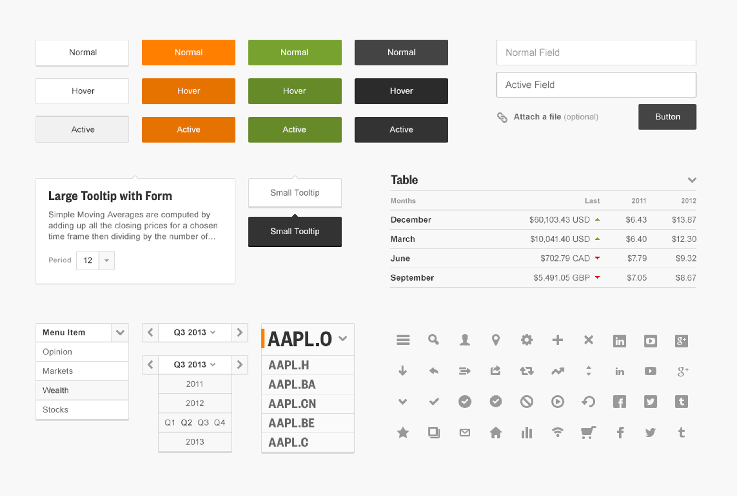
In addition to working on a range of market data initiatives, I also led an effort to develop and maintain a web style guide in order to promote design consistency. I believe strongly that the best design solutions occur when designers follow rules, and as a designer it is often critical to construct those rules yourself.
When I had joined the team, an aesthetic respective of the Reuters brand was already in place—not to mention one that elevated the brand through its modern and refined use of color coupled with strong typography. However, after zooming in it was clear that through deliberate refinement our team could benefit from spending some time constructing our own set of rules, and in turn, ultimately spend less time coralling pixels.
Designing for iOS 7
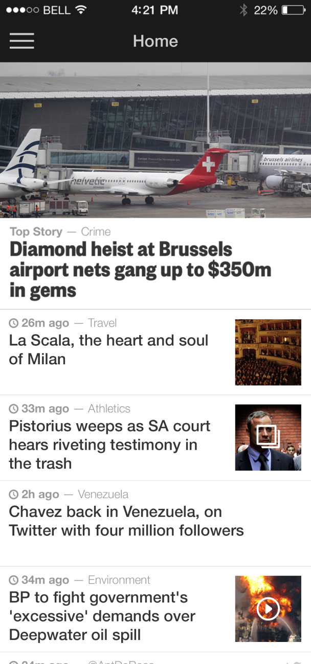
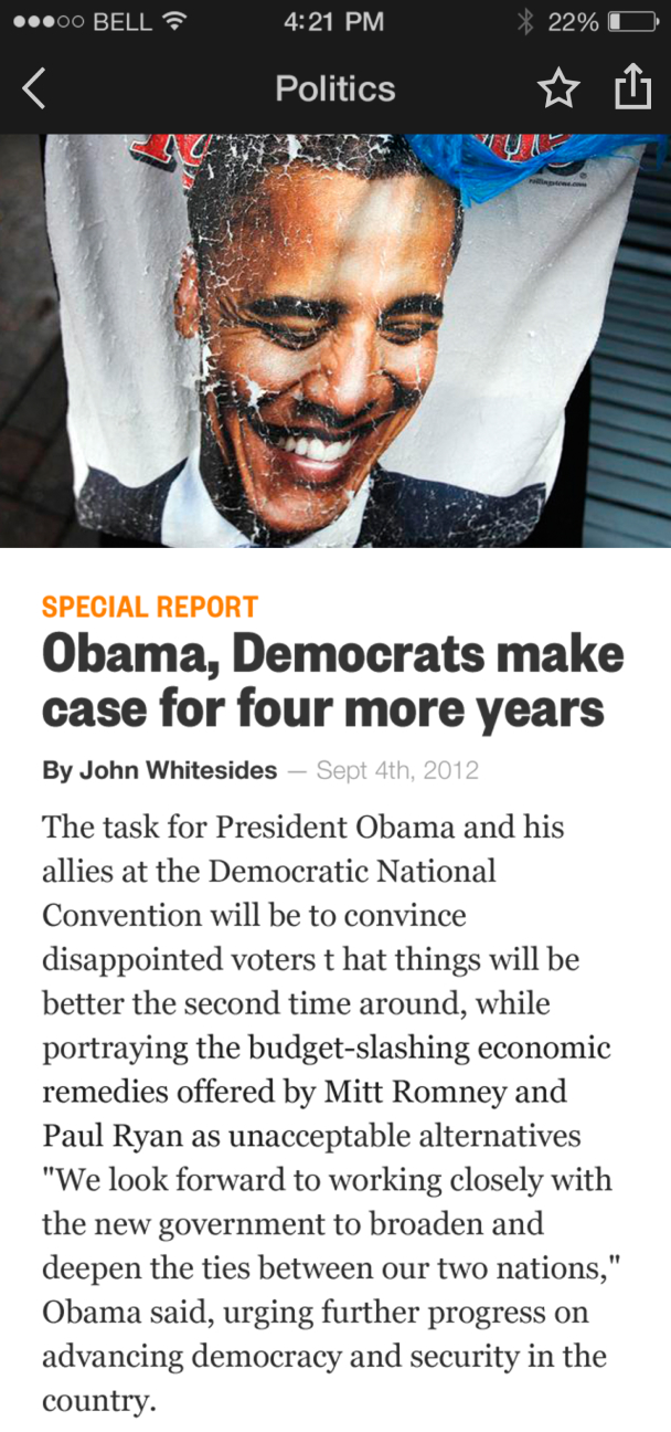
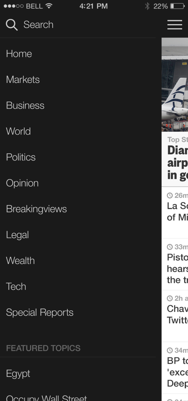
I worked with our Director of Design/UX to carefully re-craft the iconography and visual language for the release of iOS 7 (when Apple shifted to a flat design language).
Where we compromised the most, was with our typography. Type treatments play a major roll in any brand identity, and while our primary typeface was set in Founders Grotesk we adopted Apple’s preferred implimentation of Helvetica Neue.
By swaping Founders for Helvetica I believe that we wove in more tightly with the new mobile OS. This gave us some freedom to make compromises with other user interface elements — specifically, our iconography. Rather than use the hairline icons Apple had developed we repurposed our websites marks, which were thicker and tighed the desktop experience in more tightly with our iOS apps.
Closing thoughts
On design teams
In the end, I am very grateful for the opportunity to have been a part of the Reuters Next team. I had the pleasure of working with some very talented folks, from content to UX. From designing UI, to collaborating with UX designers and illustrators on a daily basis, it felt inspiring to work with so many talented contributors.
Working as a dedicated UI/Visual designer allowed me to focus on the details. I learned to quickly place trust on my colleagues and of the importance of staying in communication. Everyone’s feedback was incredibly valuable in helping us to create the best experience for our users.
On big organizations
I am grateful to have had the opportunity to work in large corporations (like Reuters) and in small startups alike. There are many benefits to working on large teams, such as systems and structures that are set in place from day one.
That said, working in a large corporation often means that things move much more slowly. This did not appear to be the case at Reuters, however after only 4 months of work the project was shut down and the team disbanded in October 2013.
Thank you
Thanks for viewing my work! Everything presented here was created for Reuters.
Contact me directly at [email protected], I’d love to chat!